
There are a lot of reasons our users love Xolo. But one of the reasons we hear about most consistently is the user interface (UI). The minimalistic design of the dashboard allows Xolopreneurs to get their admin to-dos done faster, without wasting time and brain cells trying to remember where they need to go to upload an expense receipt or create a new invoice.
But the truth is that below the surface, our product design team works really, really hard to make our user experience look and feel so effortless. And recently, there have been a number of updates in the UI department. So our UX designer has exchanged his miro boards for a google doc to explain, in his own words, what's been changed and why. Without further ado, here's Vadim:
At Xolo, everything we do is in a constant state of evolution. The Xolo user interface is no exception. Every little detail is important to us if it affects usability and information perception speed. We try to make UI updates seamless by implementing them step-by-step to stretch the time required to get used to the new changes, rather than causing unnecessary distractions with lots of new changes all at once. So if you haven't noticed the UI changes, don't feel bad. That was our goal all along.
But now that you're here reading this blog post, let's talk about the changes that have been made:
Colors
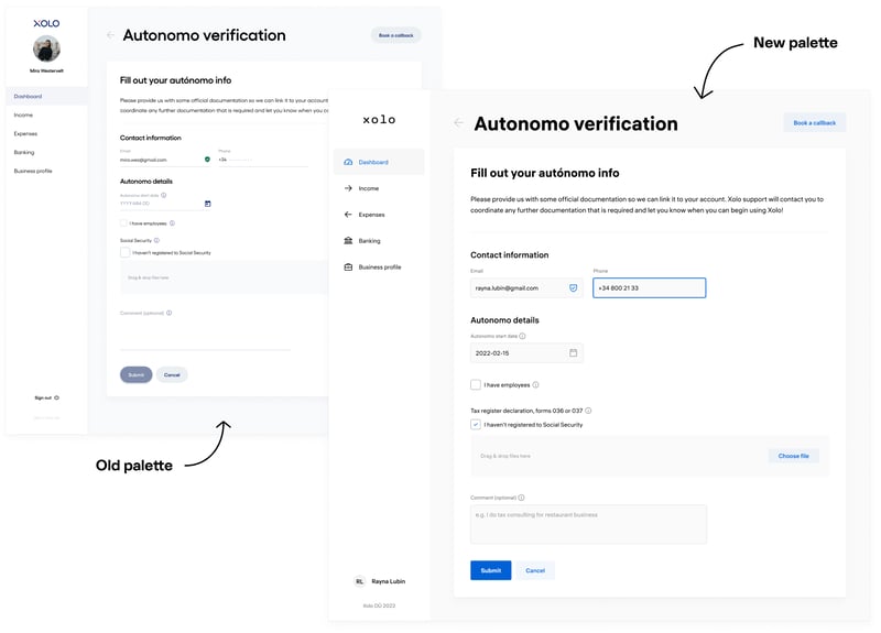
Yes, we changed the colors. The updates are subtle, but not without purpose. For starters, the Xolo colors had to be consistent with our new brand identity.
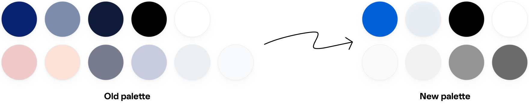
We also wanted to make better use of color coding. You'll notice that active elements are in bold, vivid colors, while background elements are in grayscale tones. This should help you to better navigate the interface and immediately understand which UI elements are interactive.
Input fields
We changed the shape of the input boxes to a more traditional rectangular form. We found that in previous iterations, it was easy to confuse input boxes with read-only information. Especially on crowded form pages, these input boxes were not easily distinguishable from other competing interface elements. We hope you'll agree that we no longer have this problem!
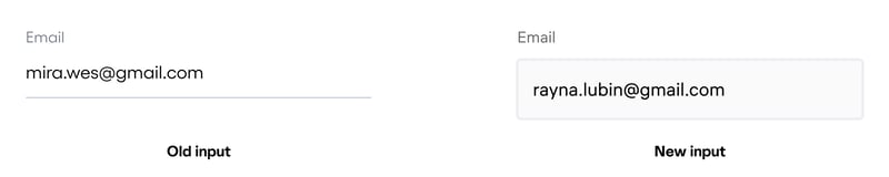
We've also boosted the vibrancy of the active input field. In layman's terms — we've made the input field being edited visually "pop" off the screen. So if you're in the middle of inputting information and you briefly glance down at your phone, this added boost of vibrancy will help you pick up right where you left off.
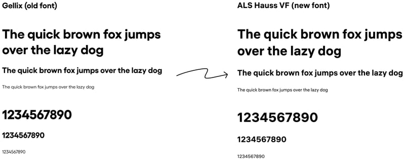
Typography
The problem with the previous typeface was its poor legibility, especially for numbers. Since we're sure you'll agree that numbers are a huge part of running a business, number legibility is essential. The new font chosen for the system is the Hauss font, which shows the amazing readability of the numbers as well as the small typeface.
Icons
We've replaced a bunch of our old icons. The former icons were all different sizes and styles. To maintain consistency with our new brand identity, we've chosen to implement the Phosphor icon library. This library fits perfectly with the new branding, which implies outlined figures.
In addition, new icons have been added to the left-hand main menu. That allows us to apply a shortened mobile version of the main menu consisting only of icons, in addition to the obvious visual appeal.
![]()
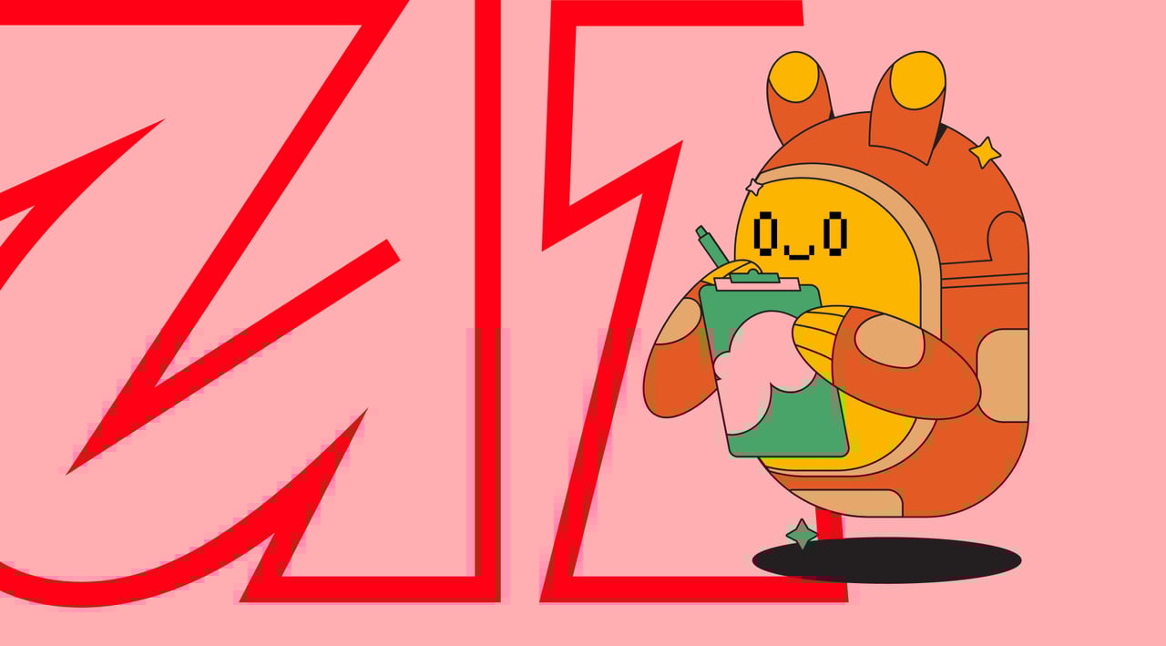
Illustrations
The old flat-style illustrations no longer fit Xolo's new brand. We've worked with the talented illustrator Valeria Potaichuk to develop stunning, imaginative, fantastical and modern illustrations for our interface.
This is not the end
As any UX designer will tell you, UI updates are always a work in progress with no end in sight. Which sounds depressing, but actually it's anything but. An interface that's easily accessible plays an important role in our mission — to make solopreneurship a magical experience. The work continues, so it's goodbye for now — but only until the next UI update.